After watching this year’s WWDC keynote in June, my initial impression of the watchOS 9 announcement was that Apple had prepared one of the largest Apple Watch updates in years. While writing my watchOS 9 overview later that day though, it felt like the scope of the changes were less than I originally thought. I needed some hands-on time with the update to know for sure.
I’ve had bad luck installing early watchOS betas in the past, so I’ve been waiting for the public beta to arrive before loading it onto my daily-driver Apple Watch. That said, I installed the developer beta right away onto an extra Apple Watch Series 4 that I’ve kept around, and have been using it as much as possible throughout the past month. I’ve ascertained a good feel for this year’s update, and can confirm that we’re looking at another mild-mannered year for the Apple Watch.
I don’t mean this as an insult at all. Rather, it’s another year of the relentless incremental refinement that Apple has long been known for, but which the company has practically turned into a science for watchOS. The formula looks something like this:
- A handful of improvements to the Workout app
- One or two new features targeted at health
- A handful of new watch faces
- One or two brand-new first-party apps
- One or two redesigned first-party apps
- A system-level feature or improvement
This year’s changes to the Workout app may be more significant than usual, but otherwise watchOS 9 fits this formula quite snugly. While it may not make for the most glamorous year-over-year updates, the strategy has cemented the Apple Watch as the most popular smartwatch in the world — by far. It’s no surprise that Apple sees no need to alter it.
While the formula may have stayed the same, there are still plenty of specifics to dig into. Let’s start with Workout, the app whose changes single-handedly led me to believe that we were getting a bigger-than-usual watchOS update this year.
Workout
As usual, Apple has put a significant amount of work into tracking ever-more-impressive workout metrics with the Apple Watch. This year, without requiring any new hardware, it feels like they’ve outdone themselves.
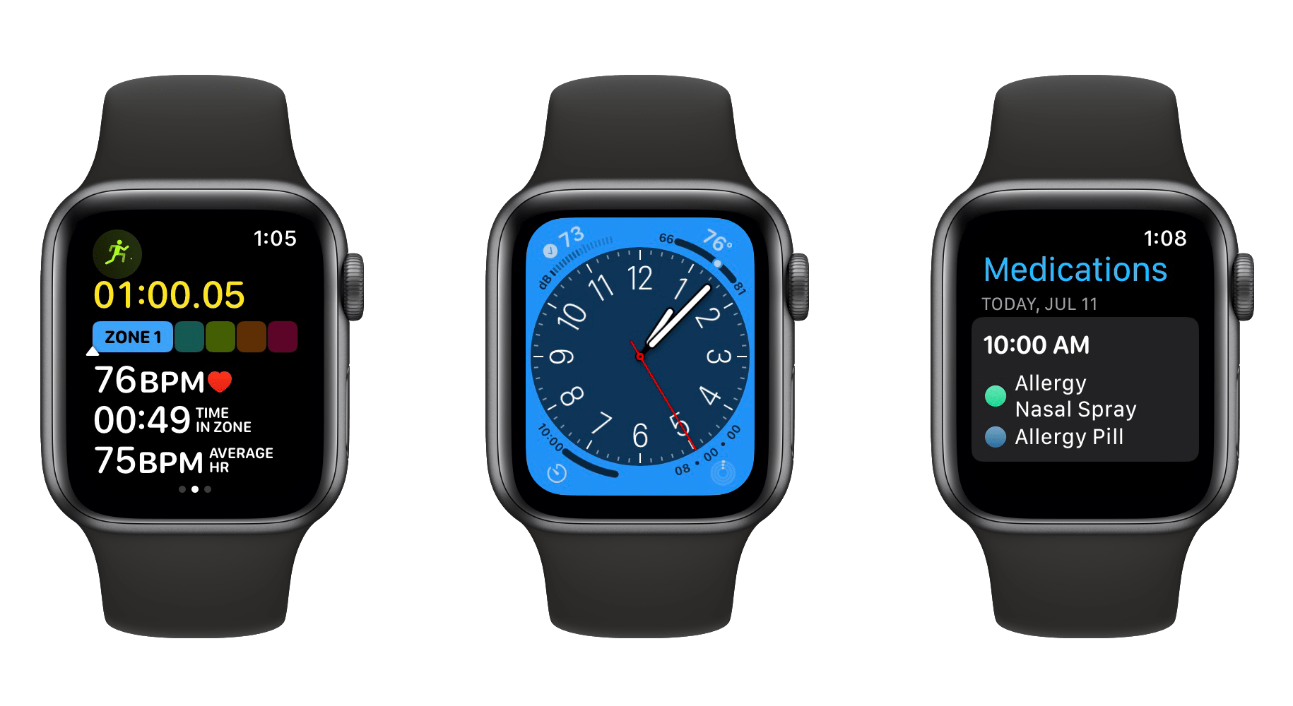
In watchOS 9, for running workouts, the Workout app can now track vertical oscillation (how much you move vertically during each stride), stride length, ground contact time, and running power. These join the previous cadence and pace metrics to present an ambitious portfolio of metrics for runners.
Alongside the new metrics, the Workout app’s center screen during active workouts now scrolls vertically to reveal further data while you exercise. You can see a live view of your activity rings, an elevation chart, heart-rate zone data, and more.
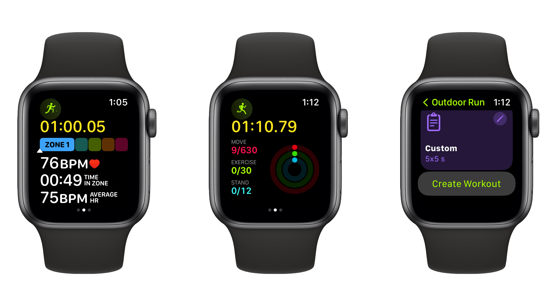
Finally, watchOS 9 includes the ability to create custom workout types, allowing you to combine multi-activity workouts into one cohesive whole. This can help you more accurately track your metrics by splitting off your warm-up and cooldown, or it can enable precise tracking of more advanced types of exercise such as triathlons.
The changes to the Workout app are very impressive, but ultimately they’re only useful to users with particular fitness tracking needs. I do track my traditional strength training workouts on my Apple Watch, but most of the watchOS 9 changes don’t apply to that workout type. I’m always happy to see Apple pursue more advanced tracking and metric capabilities for the Apple Watch, but by definition that will also mean that they’re building features for increasingly niche groups of users.
Health
This year in health, Apple added a brand-new Medications feature and made upgrades to Apple Watch sleep tracking. The battery on my Series 4 Watch isn’t what it used to be, so I haven’t done much testing of the sleep tracking yet. According to Apple though, watchOS 9 can now track detailed sleep cycle data, puzzling out your transitions between REM, Core, and Deep sleep stages. You can then view the collected data as a chart, and easily compare various nights of sleep that have been tracked over time.
Sleep tracking still requires you to set up a schedule in order to function, but I’ll be doing so and taking a deeper look at these new features for my annual watchOS review, so stay tuned for that this September to get more details on Sleep.
I’ve been testing out the new Medications feature already, and it’s looking like a truly excellent improvement to the Apple Watch this year. Medications is an all-new first-party app on the Apple Watch, as well as another view within the Health app for iOS.
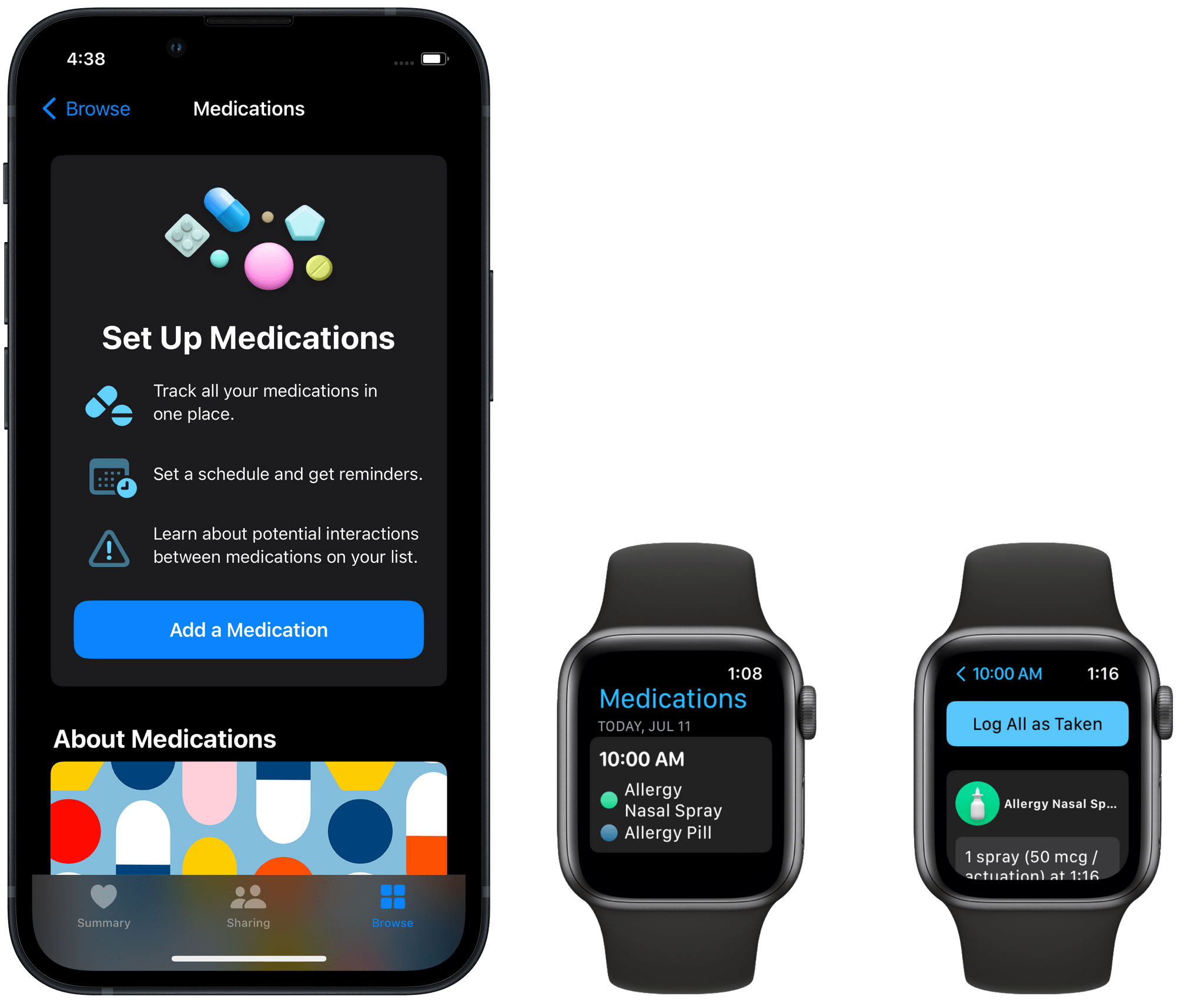
The feature needs to be set up in the Health app, where you can enter in any medications that you take regularly. Each medication can be configured with the frequency and time of day that it is taken, as well as with a cute little icon and custom color scheme to represent it.
Each medication needs to be identified by looking it up in a search field and choosing it from a list of options which match your search. This requirement enables the more advanced aspects of this feature, such as the ability to alert you if you are taking medications that have known negative interactions with each other, alcohol, or other substances. Since displaying your medications by their technical names can be unfriendly, the app allows you to set custom nicknames for each med.
Once you’ve completed your setup in the iOS Health app, the watchOS Medications app will begin to function. Each day at the times you’ve specified, you’ll get an alert reminding you to take your medications. From the alert notification you can mark the med in question as having been taken, or skip it for the day. This data is all tracked over time in the Health app.
I’ve been using the Medications app to remind me to take my daily allergy medications during the pollen-heavy Minnesota summer. My previous strategy was to leave my medication bottles in the middle of the bathroom counter every day so that I would see them in the morning and remember to take them. It has been far nicer to get reminded automatically by my Apple Watch each day. I’m a big fan of this feature, and it’s a rare recent example of a brand-new Apple Watch feature which has become distinctly integrated into my everyday life.
Watch Faces
Apple’s watch face offerings have been pretty lackluster in recent years. I’ve been using the Infograph face since watchOS 5 because I haven’t seen any other face that matches its combination of utility and decent elegance. Each year I eagerly await the new offerings, and each year I end up back on Infograph after the beta period ends.
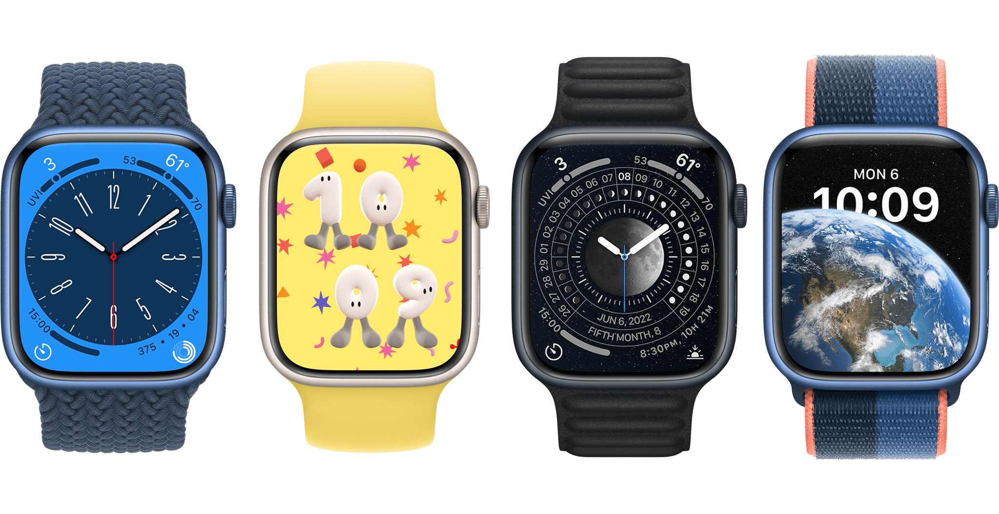
From left: the new Metropolitan, Playtime, Lunar, and Astronomy watch faces in watchOS 9. Source: Apple.
I’m not sure if it will get me off of Infograph, but watchOS 9’s new Metropolitan watch face is particularly nice. It’s pleasing to the eye, has complications in all four corners, and has a fun stretching effect on its numerals when you spin the Digital Crown. Personally I wish there was at least one complication somewhere in the center, but you can’t win ‘em all.
Playtime and Lunar mostly look like novelty throw-away faces. Playtime may be fun for kids, but it’s not as interactive as some of the other kid-friendly faces, so I expect the novelty might wear off fast.
Lastly there’s the new Astronomy face. This one isn’t for me, but it looks nice for people who are really interested in space. I did briefly enjoy switching it to the ‘solar system’ view and watching the planets orbit the sun as I spun the Digital Crown.
The biggest news on the watch face front in watchOS 9 though, is that Apple has finally taken the time to update the complications on its pre-watchOS 5 faces. This includes many classics such as Utility, Chronograph, Color, and Simple. These faces used to only work with the old style of corner complications which were much smaller and less information-dense. Now they all support the rich corner complications that were introduced on the Infograph face alongside the Apple Watch Series 4.
First-Party Apps
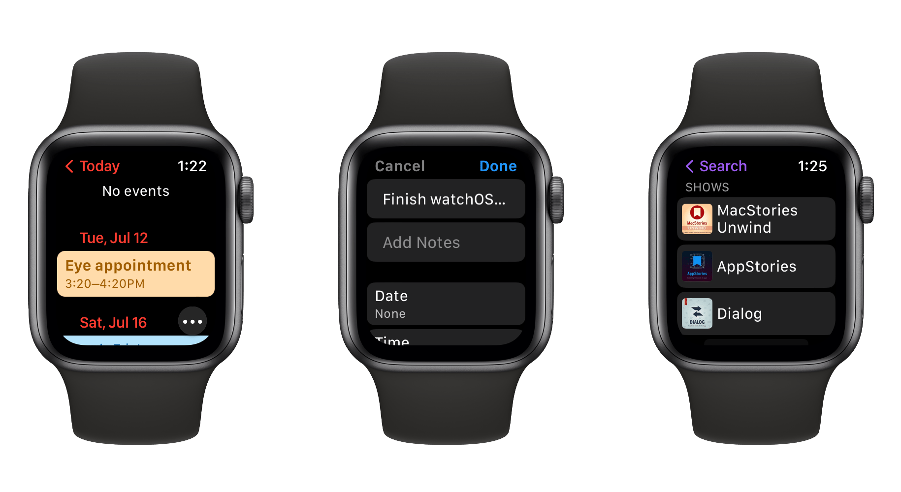
From left: the new Calendar, Reminders, and Podcasts apps in watchOS 9.
The Calendar app has finally seen some love in watchOS 9. Previous versions of this app have been read-only views of your events for a single day at a time. The new version is much nicer and more fully-featured. You can add events directly from your wrist, customize the view between ‘Up Next’, ‘Day’, and ‘List’, and zoom out to a week or month view of your calendar. This is a great update to a widely used app.
Next, the watchOS 9 Reminders app has received a small but significant change: you can now edit your reminders directly from the Watch. Previously, Reminders supported marking reminders as completed, but you couldn’t actually edit them. In watchOS 9, tapping on a reminder in a list opens a new edit view from which you can add tags, location or time alerts, notes, and more.
Finally, the Podcasts app has been granted independence from the iPhone in watchOS 9. You can now search for, follow, and unfollow new shows directly from your Watch. Selecting particular episodes to download is also supported, and the new Listen Now section will make suggestions for new shows you might like to listen to.
Banner Notifications
This year’s system-level feature change is the debut of banner notifications on the Apple Watch. Now when you’re actively using your Watch and a notification comes in, it will slide down a small banner from the top of the screen, rather than popping up a full-screen notification from the bottom.
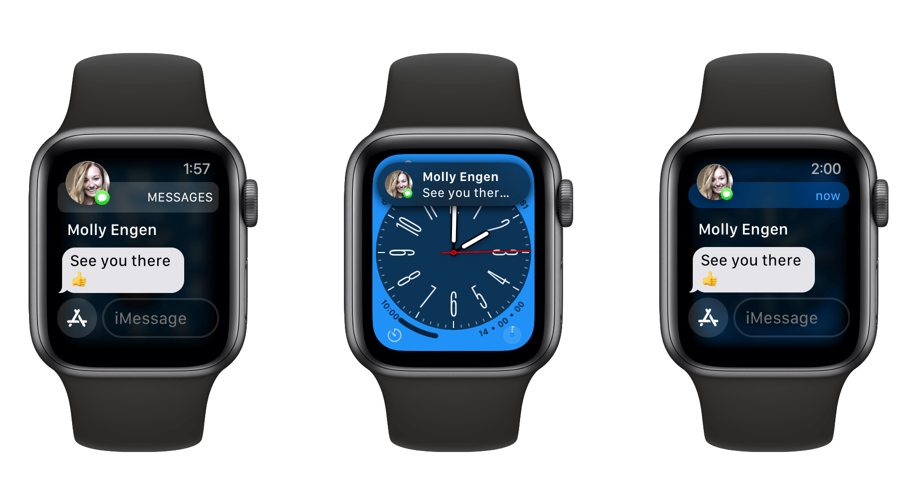
Left: watchOS 8 pop-up notification. Center: watchOS 9 banner notification. Right: expanded banner notification.
From the moment I had the first banner drop down while I was using my Apple Watch, I knew immediately that this feature was a huge improvement. I hadn’t realized before quite how disruptive full-screen notifications are when you’re trying to do something else. You can of course tap the banner to instantly expand notifications to full screen if you want to see them.
If your wrist is down when a notification comes in, raising it will bring up the usual full-screen notification automatically. I’ve found this behavior to be exactly how I want it to be. Notifications are less obtrusive when I don’t want them to interrupt me, but still show full screen when I’m only looking at my Watch to see the notification.
Conclusion
While it may not be too exciting, watchOS 9 is all upsides and no drawbacks. Calendar, Reminders, and Podcasts are significantly improved; Medications is a great new feature; and banner notifications are awesome. If you use the first-party sleep tracking feature, then there will be lots of new data for you to dig into.
For runners and cyclists, watchOS 9 might indeed be the most exciting update to the Apple Watch in years. The new advanced metrics seem truly incredible, particularly given that they work on existing Apple Watch hardware (except for the Apple Watch Series 3, which watchOS 9 will not maintain support for). Apple’s fitness team continues to kill it, and I hope they keep their foot on the gas going forward.
For those of us who aren’t fitness buffs, watchOS 9 is another standard year-over-year iteration, but there’s nothing wrong with that. Apple has once again followed its proven formula to deliver a truly nice update for us all to enjoy.
You can also follow our 2022 Summer OS Preview Series through our dedicated hub, or subscribe to its RSS feed.
Support MacStories and Unlock Extras
Founded in 2015, Club MacStories has delivered exclusive content every week for over six years.
In that time, members have enjoyed nearly 400 weekly and monthly newsletters packed with more of your favorite MacStories writing as well as Club-only podcasts, eBooks, discounts on apps, icons, and services. Join today, and you’ll get everything new that we publish every week, plus access to our entire archive of back issues and downloadable perks.
The Club expanded in 2021 with Club MacStories+ and Club Premier. Club MacStories+ members enjoy even more exclusive stories, a vibrant Discord community, a rotating roster of app discounts, and more. And, with Club Premier, you get everything we offer at every Club level plus an extended, ad-free version of our podcast AppStories that is delivered early each week in high-bitrate audio.
Join Now
